

Corporate illustration

Roly’s Fudge
Bespoke Advent Calendar
packaging design and illustration
Luxury Christmas Advent Calendar
I was thrilled to be asked to work on the Roly’s Fudge advent calendar, being familiar with the brand and the seriously moreish fudge! It’s been a goal of mine to create an advent calendar, and getting the opportunity to be a part of creating this calendar, a premium product for Roly’s Fudge, was a fantastic challenge that I couldn’t turn down.
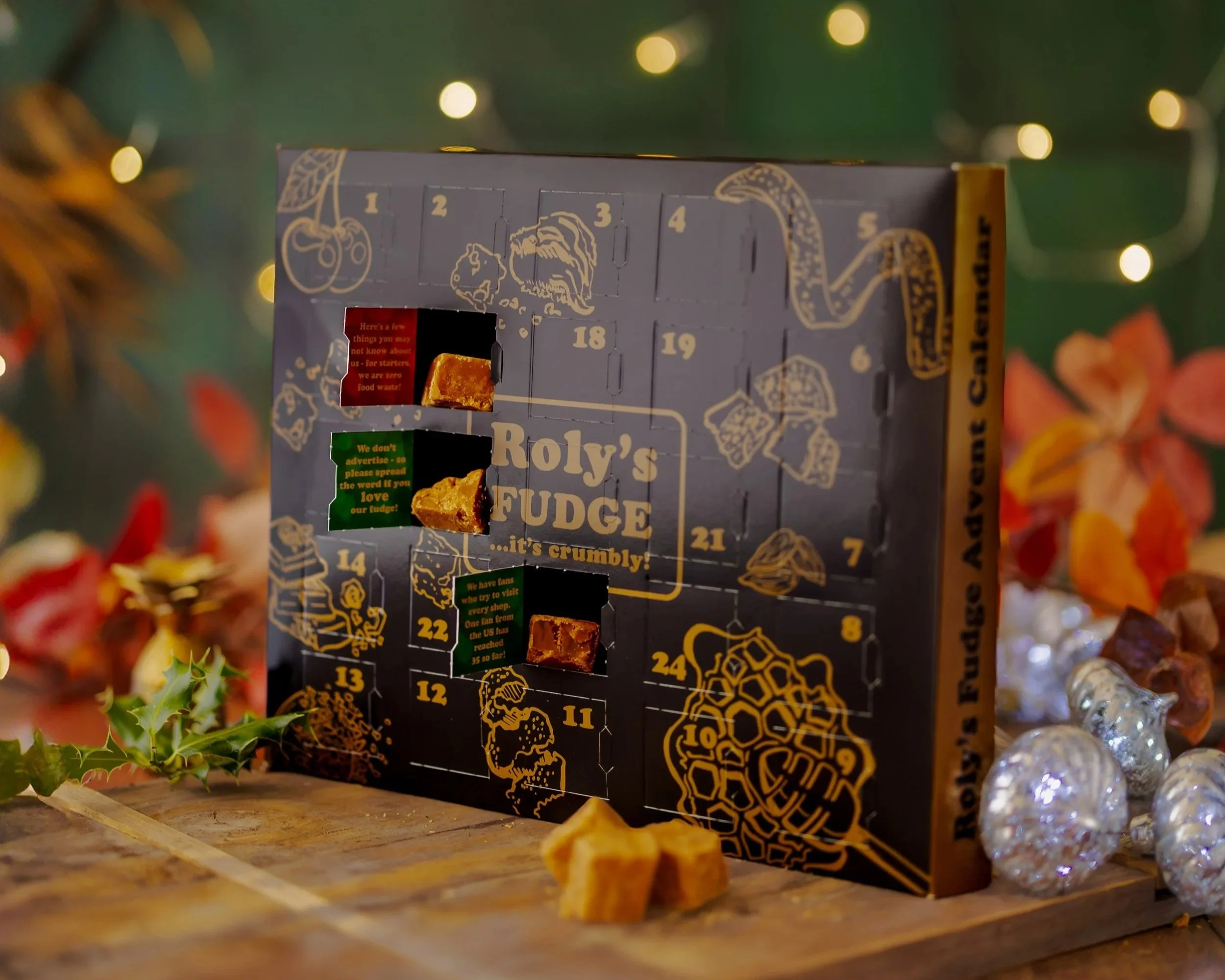
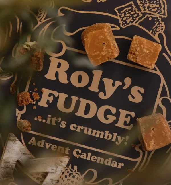
Keeping Roly’s recognisable black and gold colourway, we worked together to develop the idea of a fudge ‘wreath’.
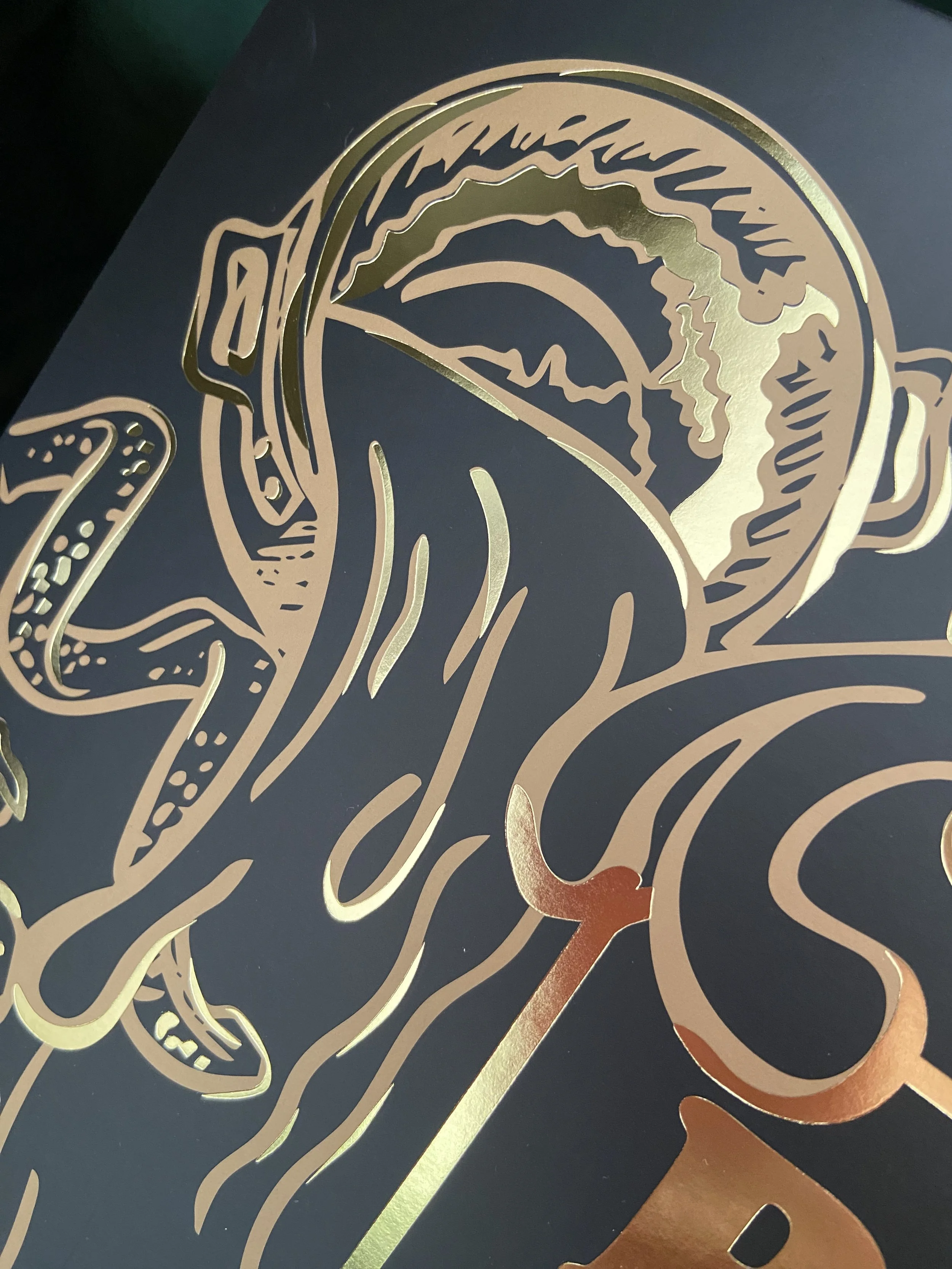
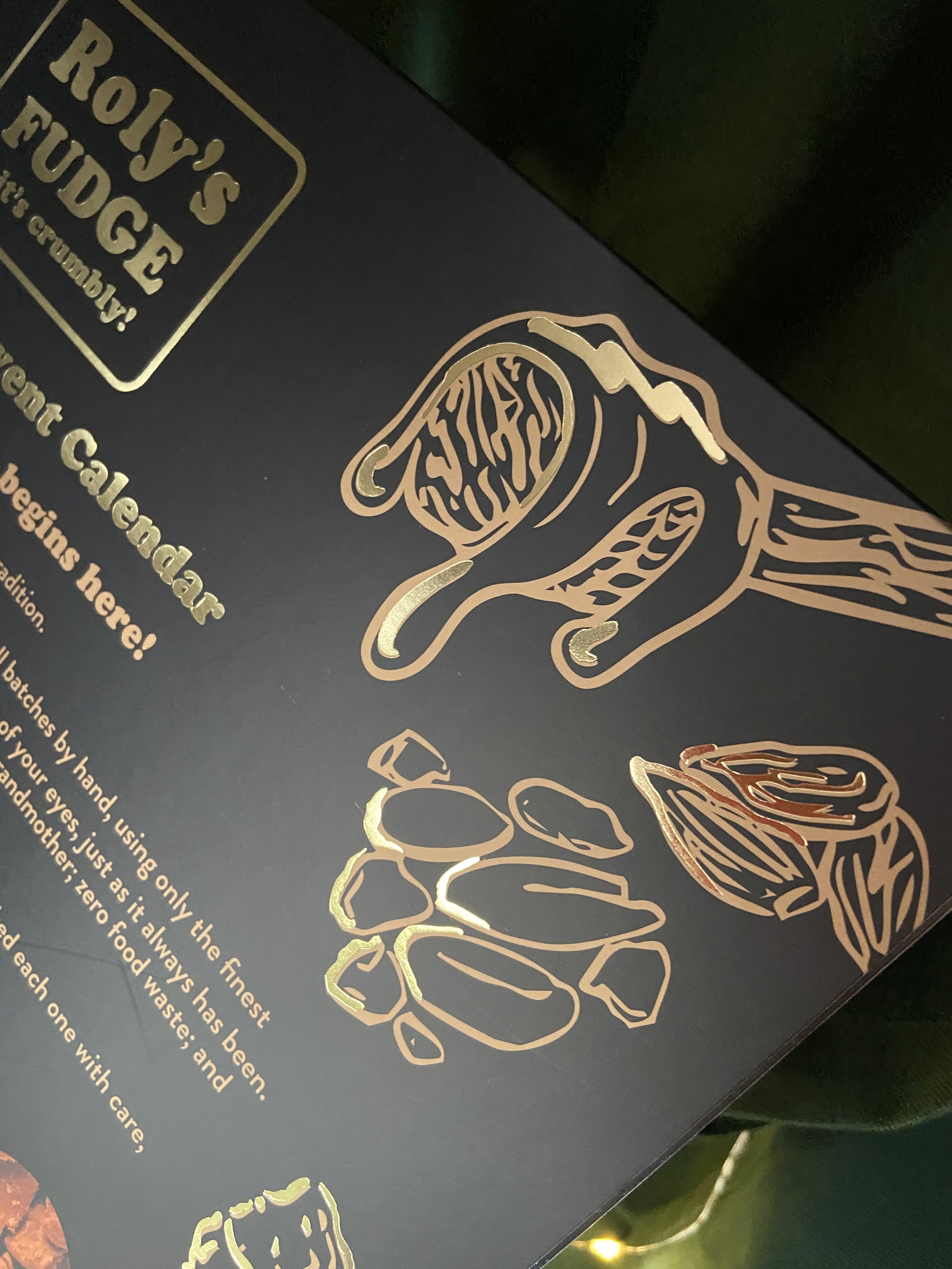
I wanted to feature the iconic copper pots that fudge pantries traditionally use, and incorporate ‘the pour’, which is such an important part of the fudge making process.
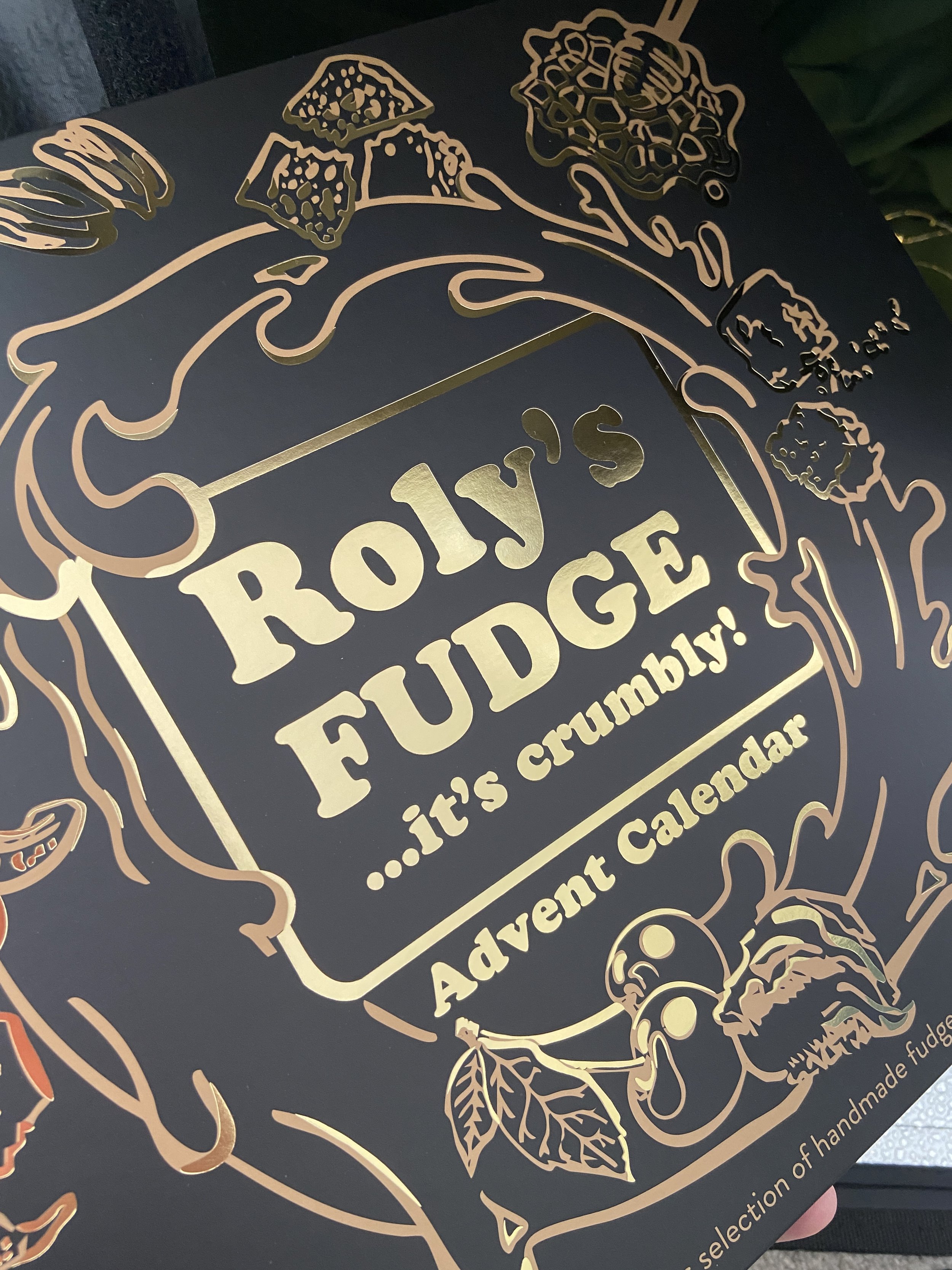
On the calendar box sleeve, molten fudge swirls around the luxuriously gold-foiled logo to create a Christmas wreath, with key ingredients of Roly’s Fudge flavours (those featuring in the festive selection) interacting with the swirl, just as decorations do in a traditional Christmas wreath.
I drew all of the bespoke illustrations by hand to create expressive, impactful visuals and reflect the brand’s emphasis on high quality ingredients, handmade products and supporting its independent pantries.

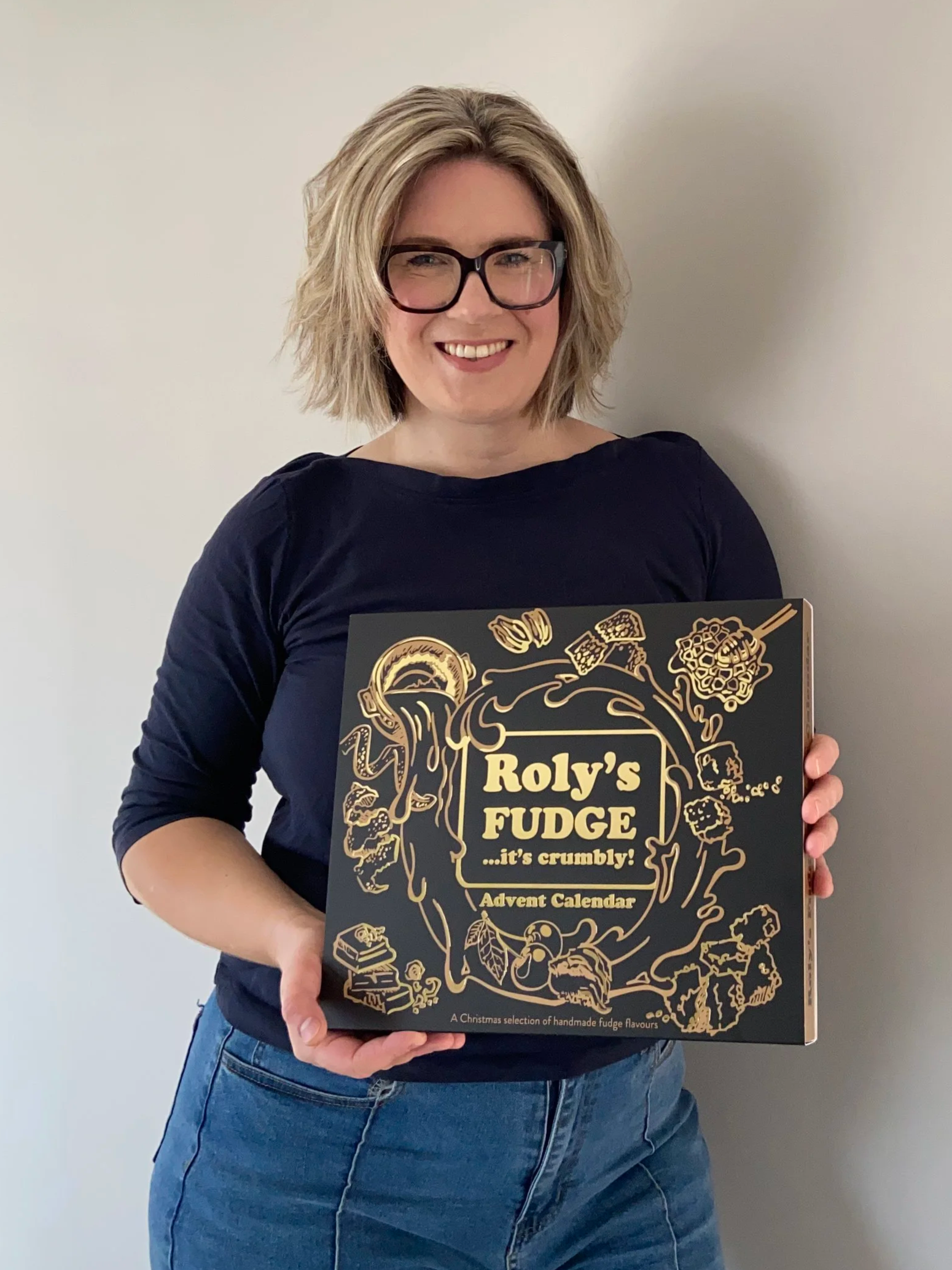
Roly’s advent calendar front of box sleeve
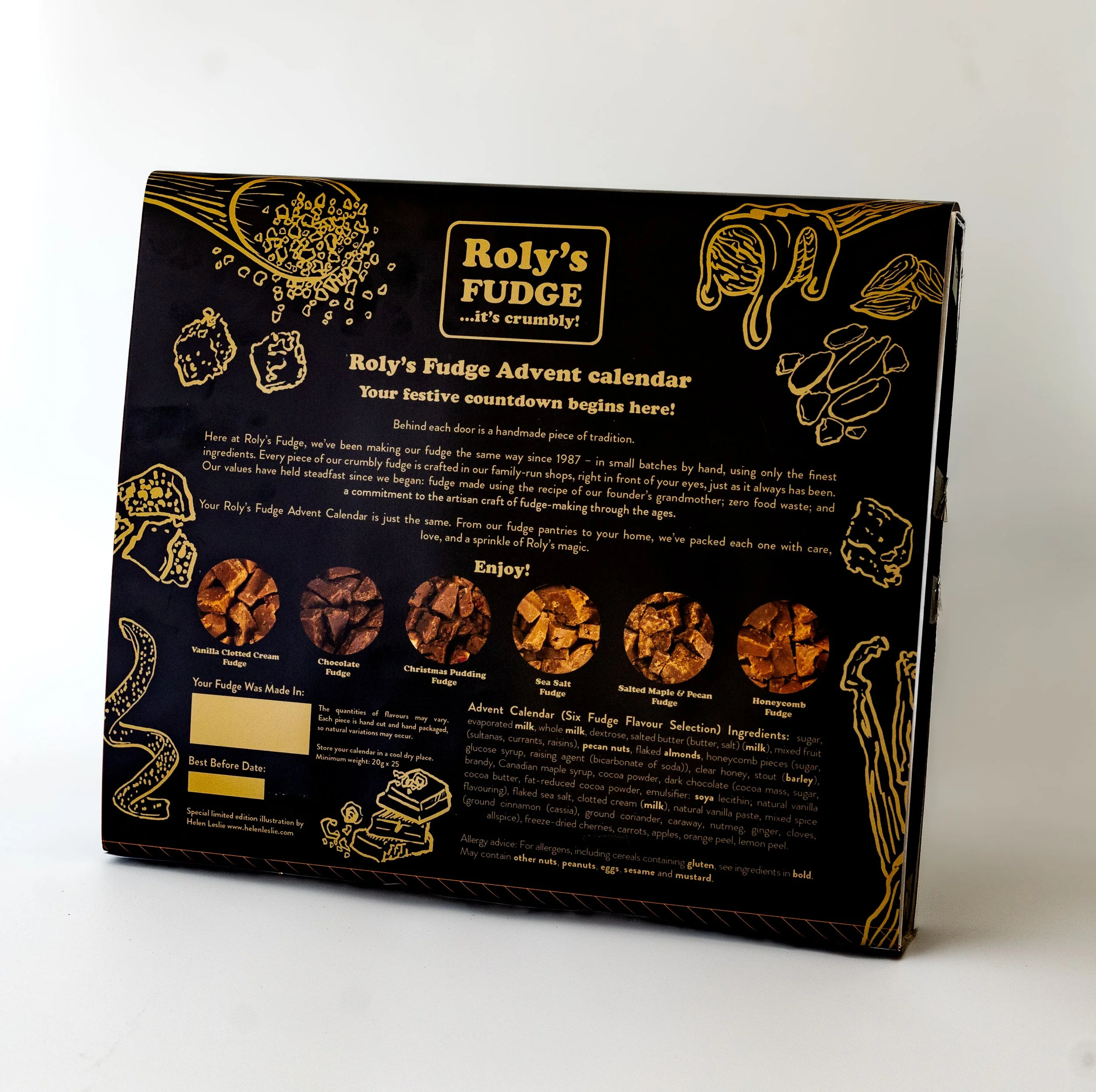
Roly’s advent calendar reverse of box sleeve
Conveying light and shade in the illustrations was tricky when only using line work. By using a combination of expressive hand-drawn illustrations and printing techniques, we have created a seriously sumptuous advent calendar for the festive countdown.
The calendars are enclosed in a matt black card sleeve with the illustrations in Roly’s gold metallic ink. I hand-illustrated the highlights, picked out in stunning gold foil, to add shine, texture and luxury. All the highlights are designed to represent the shine emanating from the gold foiled Roly’s logo in the centre.
The calendar box itself is black card with its sides giving a flash of colour in gold metallic ink, ensuring the boxes look beautiful from front, side or back when on display in shops (and then your own home of course!)
Further ingredient illustrations continue on the calendar front and back, weaving around the gold foiled advent dates on each door. The back of the box is also full of detail, with illustrations and full colour pictures of the fudge as well as the required details and information.
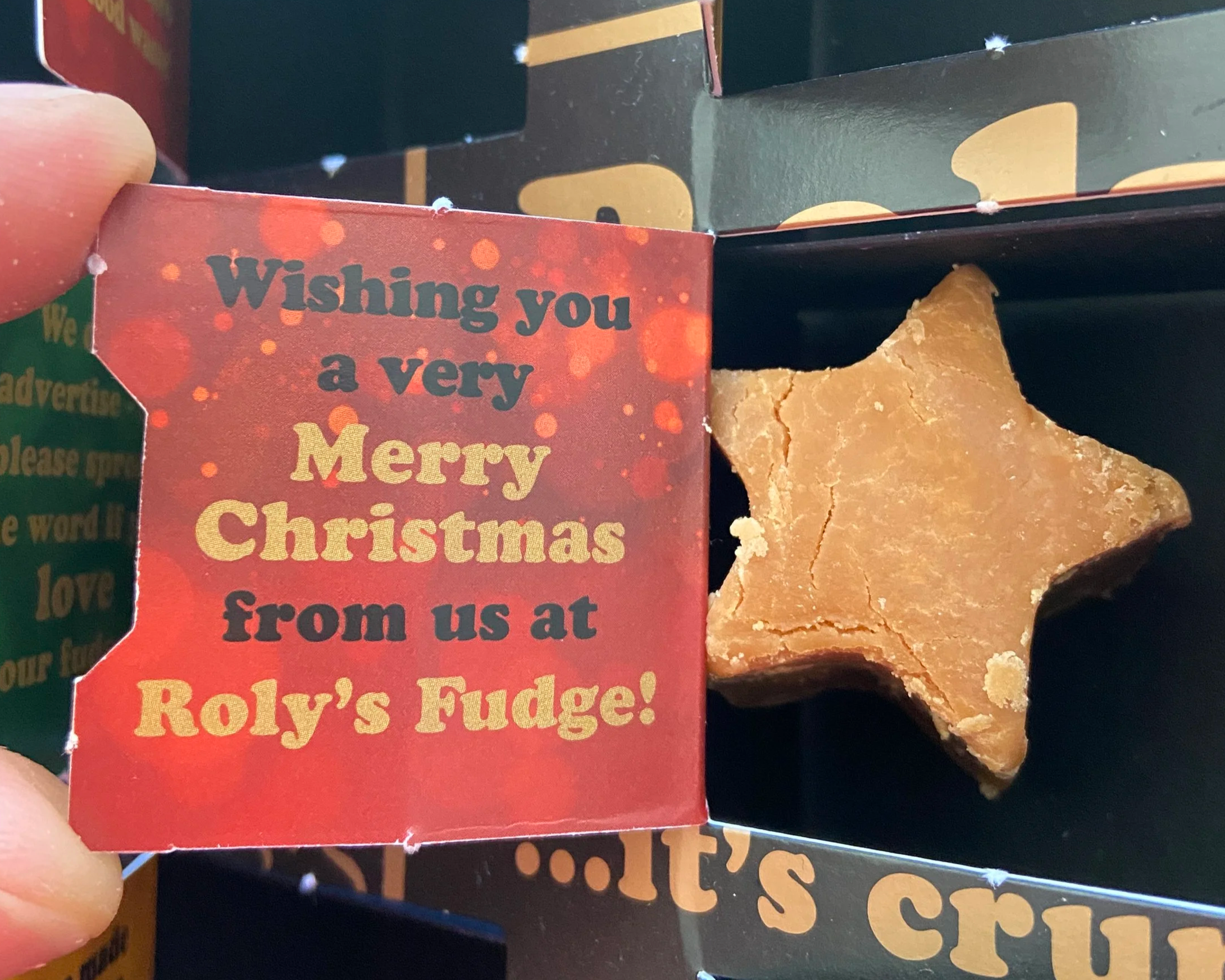
The treats don’t end with the outside of the box. Every door that opens is beautifully designed and has a fact about Roly’s, so each day you uncover something you probably didn’t know about the creators of the delicious crumbly fudge. The box tray is cardboard to ensure it is fully recyclable.
Every door - and there are 25 of them - contains a delicious chunk of Roly’s fudge, each one packaged for freshness by hand in Roly’s pantries across the country.
The overall result is a wonderfully luxurious advent calendar - a real treat for fans of Roly’s Fudge in the festive season. I hope that the packaging is so beautiful you want to keep it!
Photography copyright Nick Hook and Roly’s Fudge
“Helen has been a dream to work with from start to finish. We came to Helen with the vaguest of briefs for what we wanted for an Advent Calendar. Together we sat and penned out some rough ideas, including ideas Helen had that we hadn’t even thought about.
Our brief was challenging - illustrations on a black background (with gold as the highlight), we realised straight away, is not the easiest specification to work with. As a result, we had to trial a number of ideas and returned back to basics more than a couple of times!
However what really kept us motivated through the process was Helen’s patience and willingness to adapt and work with us through different ideas. Her approach was flexible and easy-going, with plenty of input and consideration across different elements of the project which made everything much easier for us.
Not only did Helen work on the illustrations but she also did the entire layout of the design which meant working with and adapting to some real nitty-gritty elements of the business, such as allergens and nutritional information, which she did to 100% accuracy. She worked as a go-between with us and our manufacturer to create a product beyond what we could have imagined from the initial meeting.
We are already looking at ways to work with Helen in the future with other creative projects. Thank you Helen!”
Where can I purchase the calendar?
Next Christmas the advent calendar can be preordered online at Roly’s Fudge and will be available to buy in Roly’s Fudge pantries.
Photography copyright Nick Hook and Roly’s Fudge
Freshwater
Habitats Trust
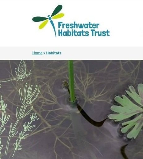

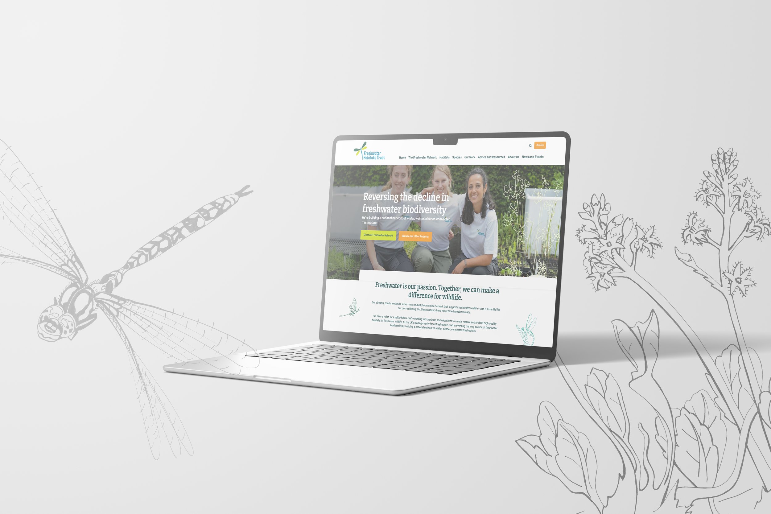
Freshwater Habitats Trust website - close up showing illustration usage with photography
Project: Bespoke website illustrations
I was delighted to be asked to work with national wildlife conservation charity Freshwater Habitats Trust on a series of illustrations for their new website, which was in development.
The aim was to represent several species – both common and rare - found in specific types of freshwater habitats of the UK, including pond plants, insects, tadpoles and more.
These illustrations would be used to add character and individuality to the site, accompanying photography and graphics throughout the site header panels and in-body content.
My experience in digital came in very handy during this project, as we wanted hand-drawn line illustrations which needed to be flexible enough to use at any size, with transparent backgrounds, and with consistent style and ‘legibility’ on the site.
I was able to illustrate each species by hand, from the imagery and information provided by the client, and worked together with Sarah Hoyle, Communications and Media Manager, and Dr Naomi Ewald, Technical Director to ensure accuracy in the illustrations.
It was important that the illustrations had character and a hand-drawn look, without being inaccurate or whimsical, so it was vital that I could adjust the illustrations where necessary for scientific accuracy.
Vectorising the line work and supplying each element separately meant that each illustration could be coloured and placed as required, and used at any size without reduction in quality.
The Freshwater Habitats Trust website has now gone live with a bright, professional look and easy to use content and structure. The illustrations, used both in page headers and to contrast with and accompany photographic imagery throughout, add a distinctive, individual style to the site that cannot be gained with generic stock imagery.
With thanks to Sarah, Naomi and the team for their constructive feedback and enthusiasm for the project, I found it so interesting to learn about their areas of specialism and producing the illustrations was a very enjoyable challenge! It was a great project to be a part of and the new website is a valuable asset to the Trust.

“When we were working with Free Thinking Design on the designs for our new website, we agreed that illustrations would give our site a more natural, distinctive look - and convey our passion for freshwater. However, we soon realised that we couldn’t find the style of illustrations depicting the habitats and species we wanted to feature. That’s when we asked Helen to create bespoke illustrations.
“We gave Helen a pretty tough brief. The illustrations had to be accurate as well as decorative and with enough detail to add interest, but not too much to detract from the rest of the website. We needed them to work as outlines and as frames around text and images. We were also dealing with a pretty niche subject matter as many of the plant and animal species we asked Helen to draw are rare or threatened.
“Helen rose to the challenge. She really understood our brief and her digital experience meant that she also knew what our website developers needed. Helen brought a creative approach and was extremely flexible and a real pleasure to work with. We are delighted with the result. Thank you, Helen, for playing such an important role in our new website.”
Sarah Hoyle, Communications and Media Manager, Freshwater Habitats Trust
Figgy’s Puddings: handmade luxury Christmas Pudding makers
Project: Illustration and design for retail packaging

“Helen took my idea from a vague daydream to a beautiful bespoke illustration which our customers absolutely love”
Jo Evans, Figgy’s Puddings Founder and Owner
Luxurious, traditional…
and fun!

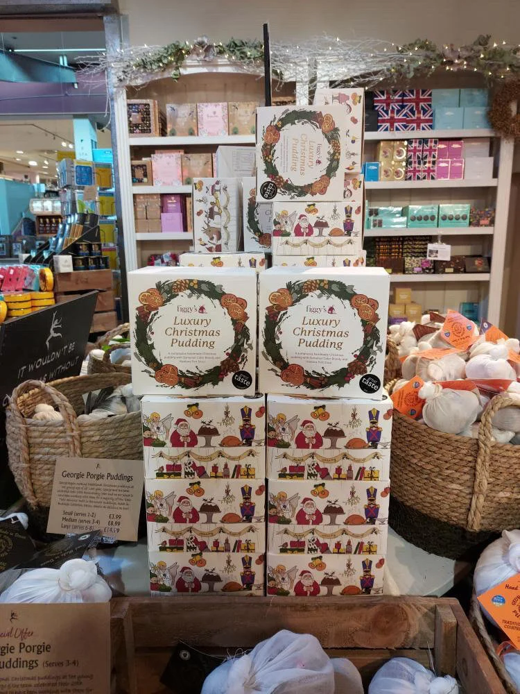
Spotting the puds in the wild at Greendale Farm Shop
I was asked by Jo Evans from Devon-based independent food producer, Figgy’s Puddings, to illustrate and design packaging for their award-winning handmade Christmas puddings. Already successful as an online retail business, Figgy’s Christmas puddings are now also available in farm shops, delis and garden centres across the UK during the Christmas season.
Having designed and illustrated the Figgy’s Puddings logo with my partner in design Darren @stripecreativeltd several years ago, we were thrilled to have the opportunity to work with the brand as they make the leap into the independent retail sector.
It was a dream project to work on, with a relatively open brief of fun, unusual - yet traditional, high quality Christmas packaging. We discussed ideas around a Christmas dinner table with lots of activity, all the traditional trimmings and just a little bit of chaos!
We wanted the box to be eye-catching on the shelf, so bright but not garish colours were required. We used gold foil to highlight details in the Christmas wreath on the box lid and the product name.
We really wanted the interior to provide a bit of a surprise, so we made a repeat pattern of my sprout, cracker, bell and pudding illustrations, which looks warm and fun.
The leaflet, which needed to sit on the top of the pudding bowl inside the box, needed to coordinate but be noticeable as it contained the heating instructions. We used the Christmas wreath illustration but also added some humorous touches inside with a robin and little pile of sprouts* making an appearance!
*we promise there are no sprouts in the actual Christmas pudding!

“Helen Leslie is brilliant to work with. Not only is she a talented illustrator, she is also able to envisage exactly what I need, even when my description is somewhat ethereal!
She took my idea from a vague daydream to a beautiful bespoke illustration which our customers absolutely love.
I’m so pleased with the results – it’s exactly what I’d hoped for.
I knew Helen would come up with something amazing!”
Jo Evans, Figgy’s Puddings
Gallery
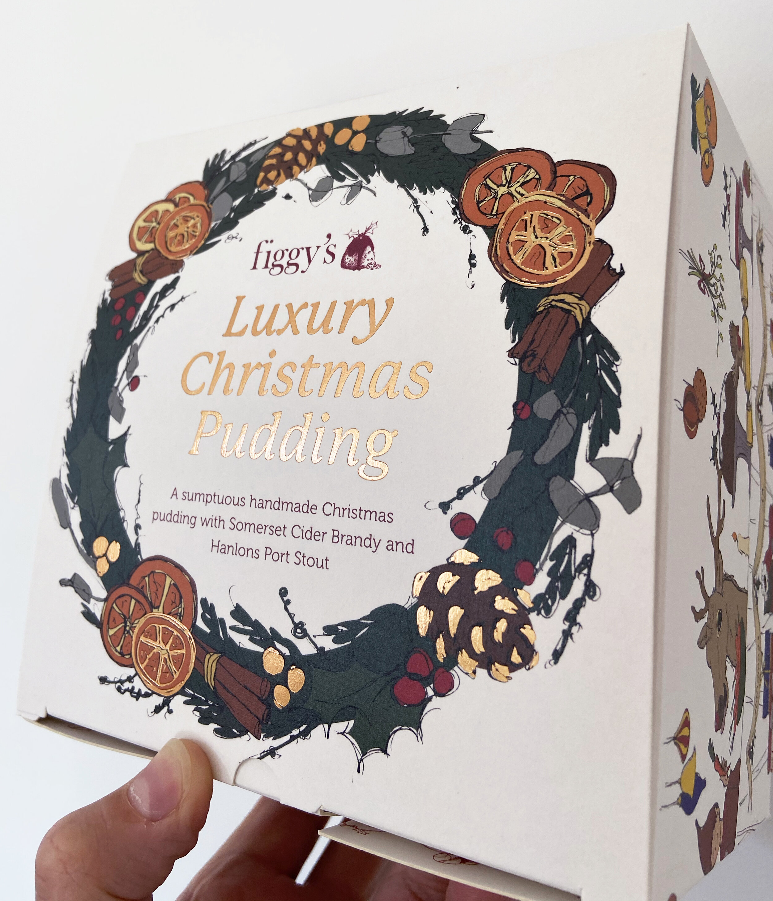
Top of box with wreath illustration and gold foil highlights. Printing by Dayfold Print Ltd
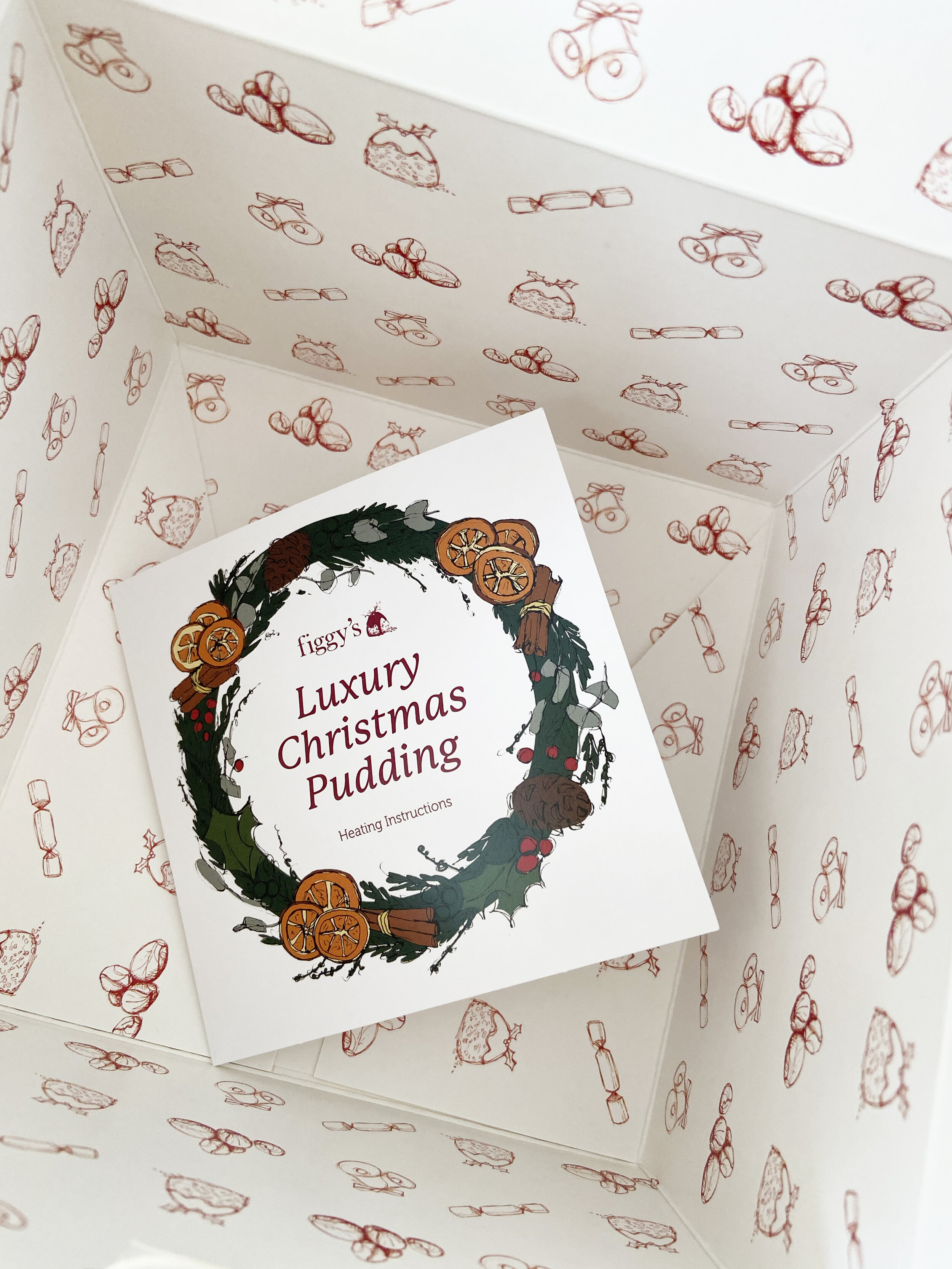
Box interior with leaflet

Side of pudding box

Side of pudding box

Front side of pudding box

Interior leaflet

Interior leaflet

Display at Bon Gout Deli, Exeter

Display at Dart's Farm, Topsham
Display at Dart's Farm, Topsham
Exeter Leukaemia Fund
Project: Bespoke illustration for Legacy Giving leaflets
Towards the end of 2024 it was great to work with Exeter Leukaemia Fund on a bespoke illustration for the charity's Legacy Giving leaflets. I chose natural elements for the illustration with relevant symbolism to the topic of legacy giving - Oak leaves for strength and steadfastness, Beech leaves for protecting life, Maple leaves for connection (between heaven and earth, for those leaving a legacy gift, remembering loved ones or those benefiting from ELF's support), Forget-me-nots for remembrance, Daffodils for hope, and Lilies for healing, remembrance and peace.
The resulting illustration brings a fresh, uplifting and original feel to the leaflets, which I hope people considering leaving a legacy gift or those who benefit from the charity's amazing work find to be memorable and symbolic.
